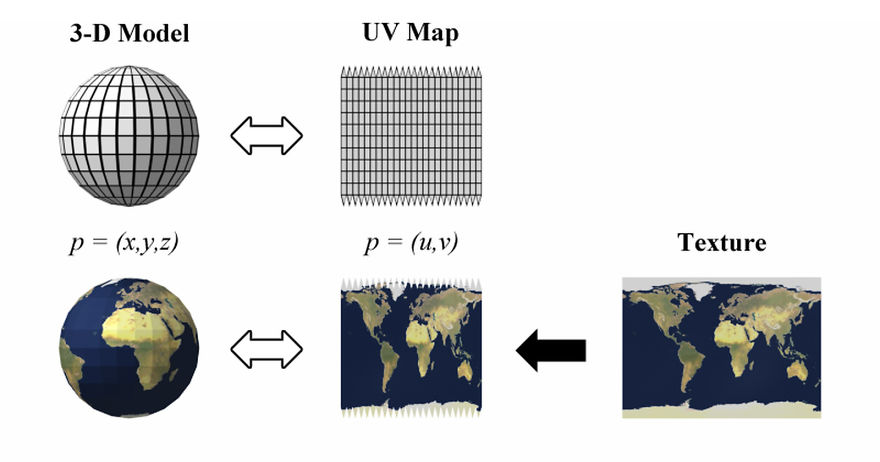
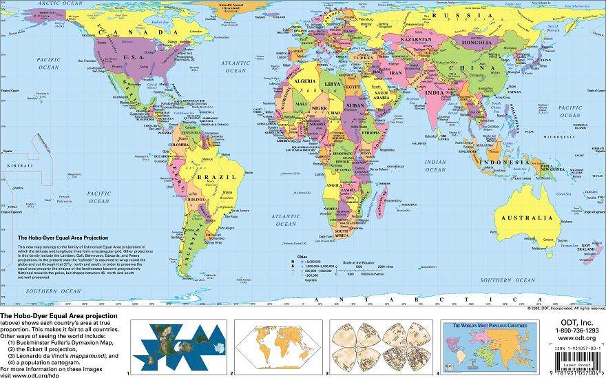
The reason why certain countries look bigger or smaller than others is that of something called the Mercator Projection. Putting a 3D planet on a two-dimensional world map was something of a challenge for early cartographers. So a Flemish geographer and cartographer named Gerardus Mercator came up with a solution for the most accurate world map. In 1569 he designed an atlas that could be accurately used for navigation purposes. Still, the downside was that his system distorted the size of objects depending on their position relative to the equator. Because of this, landmasses like Antarctica and Greenland appeared much bigger than they actually are. Though there are around 40 types of map projections, from conical to polyhedral and retroazimuthal, depicting the true size maps, this one is still used the most because of its convenience and simplicity. And none of these projections can be titled ‘the real world map,’ just because they all depict the same Earth through a different lens.
To show how incorrect our understanding of countries by size is, a website called thetruesize.com lets you move landmasses into different locations. Bored Panda has played a bit on world maps with countries provided by this site, and this is what we found.
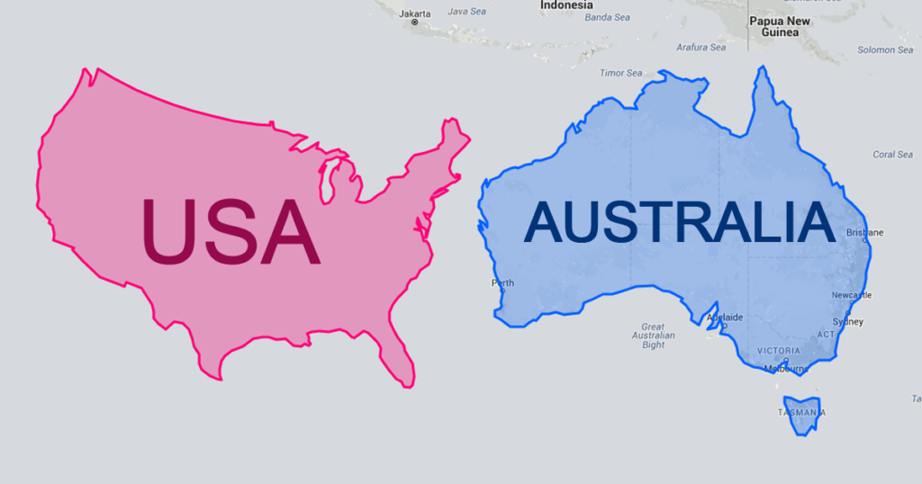
#1
US Moved Down Next To Australia Looks Unbelievably Small
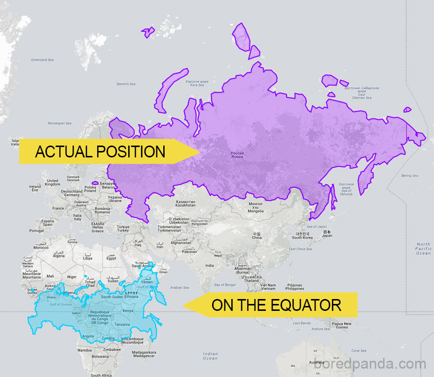
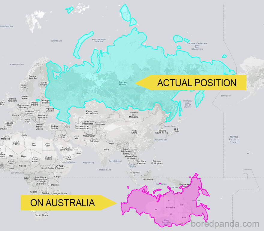
#2
Russia On The Equator Is Not A Giant Bear Anymore
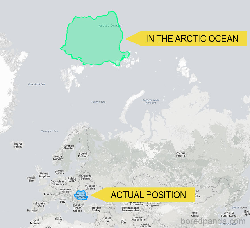
#3
If Romania Was An Island In The Arctic Ocean
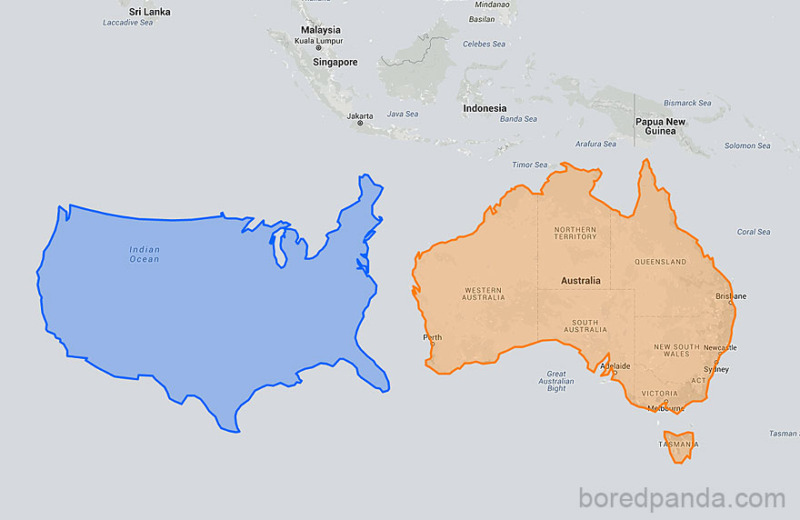
#4
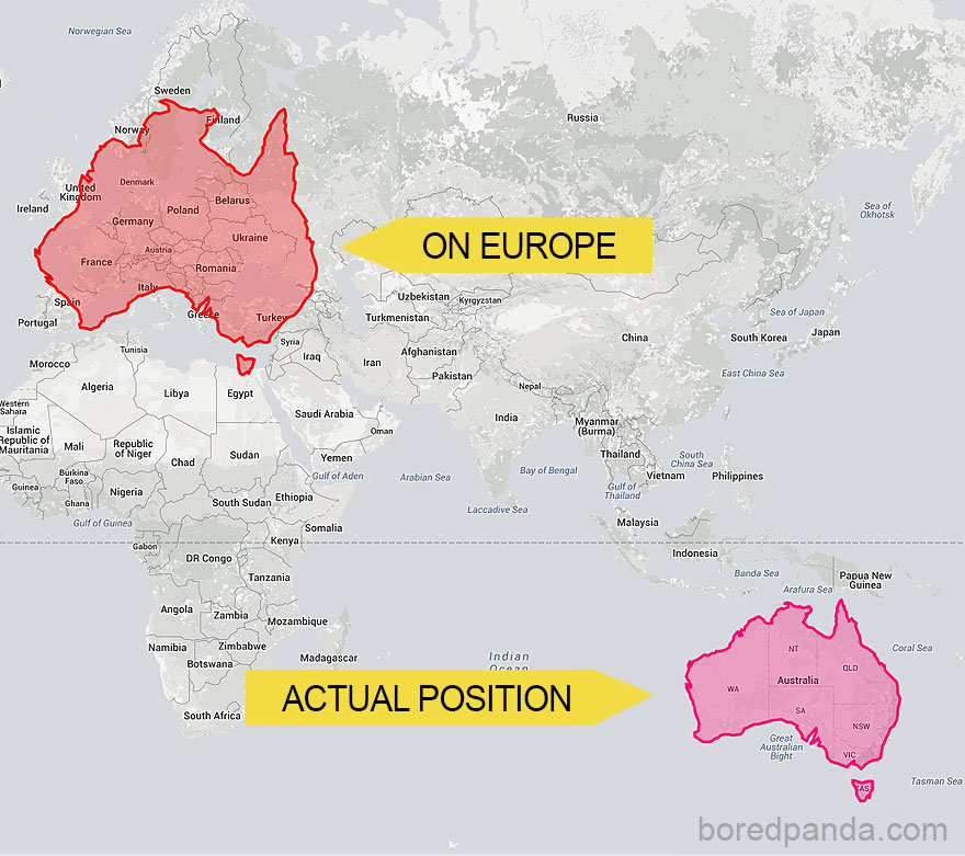
Australia Is Way Bigger Than You May Think – It Covers Almost The Whole Of Europe
#5
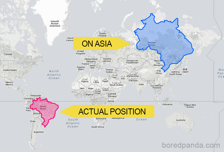
If Brazil Was In Asia It Would Be Massive
#6
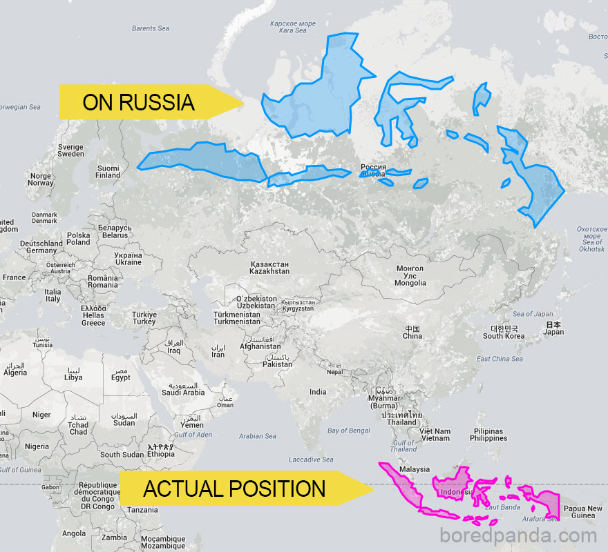
Indonesia Would Spread Almost Across The Whole Of Russia
#7
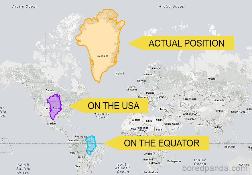
Greenland Is Not So Big When Compared To USA And Brazil
#8
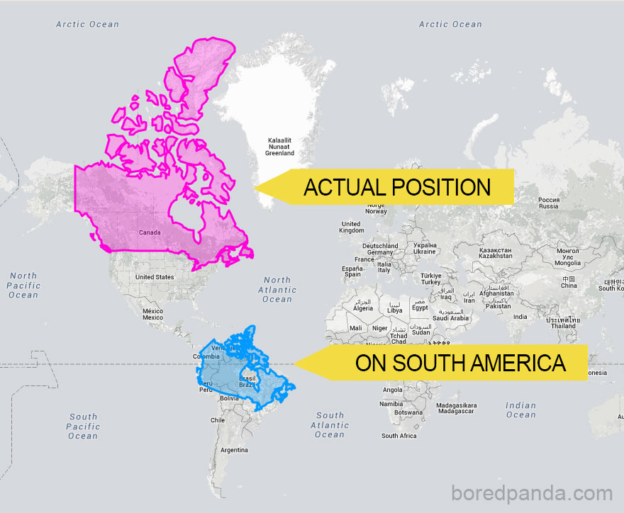
When You Move Canada To South America
#9
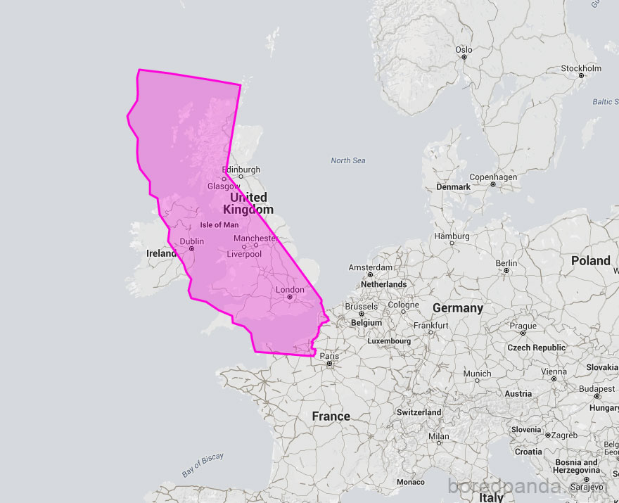
California Moved Onto The UK Shows They’re Quite Similar In Size
#10
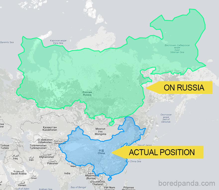
China Placed On Top Of Russia
#11
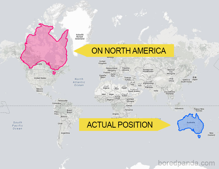
Australia Moved Onto North America Becomes REALLY Big
#12
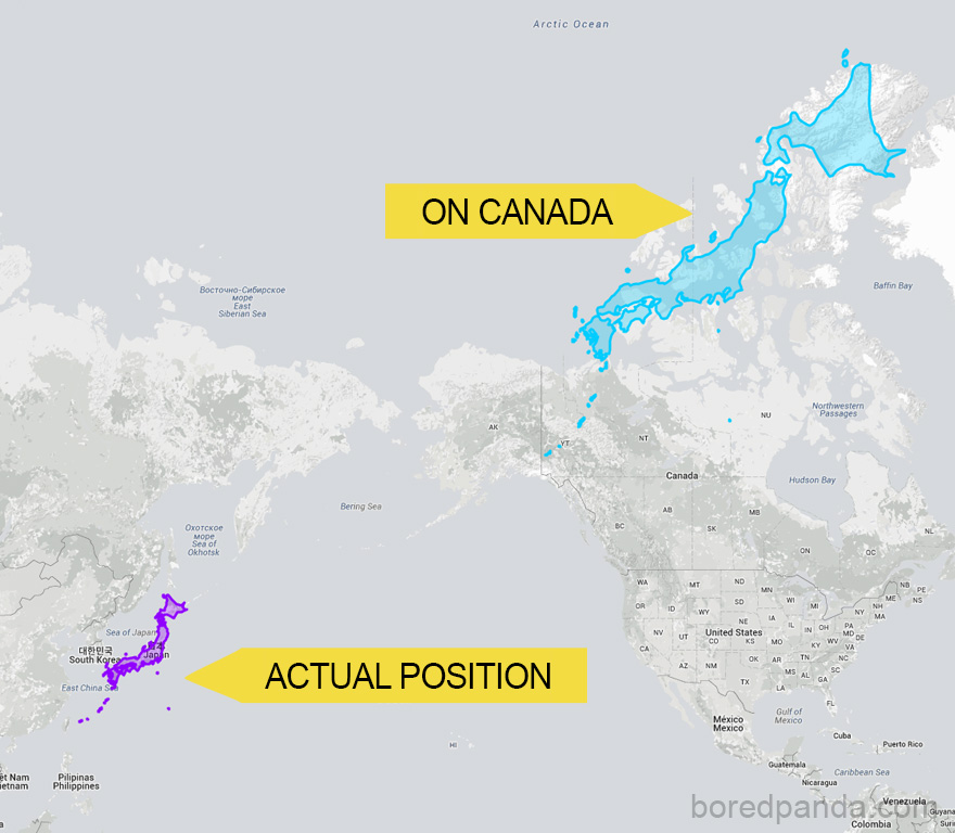
Japan Can Stretch Almost Across Canada
#13
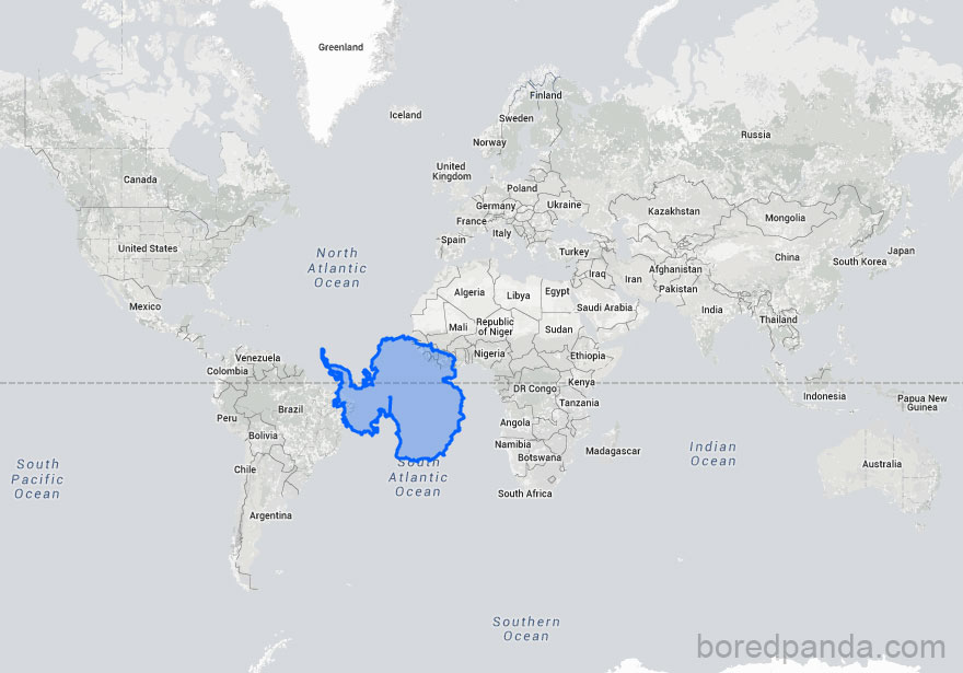
Antarctica Is Not So Much Larger Than Brazil
#14
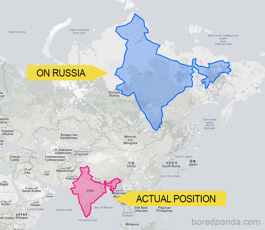
This Is How India Changes As You Move It North
#15
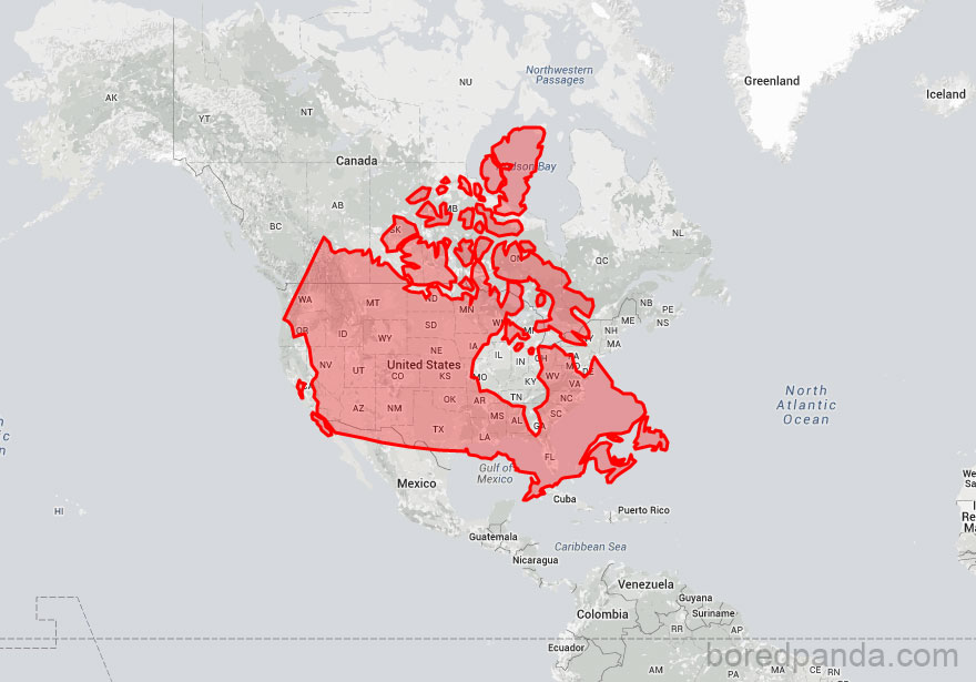
Canada Moved Down Onto The US Reveals That Both Countries Are Pretty Much The Same Size
#16
How This All Works
#17
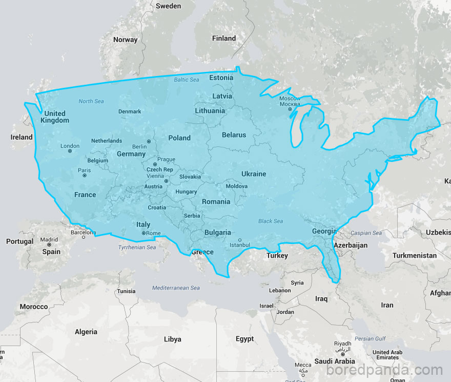
USA Compared To Europe
#18
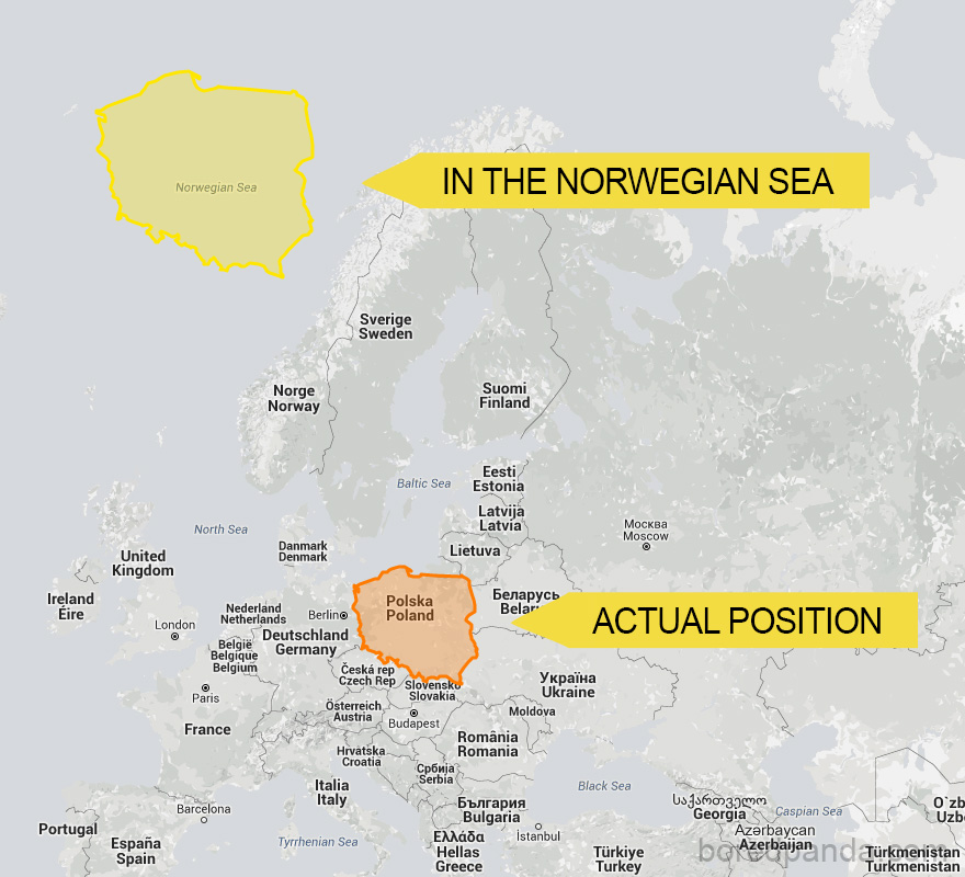
If Poland Was An Island In The Norwegian Sea
#19
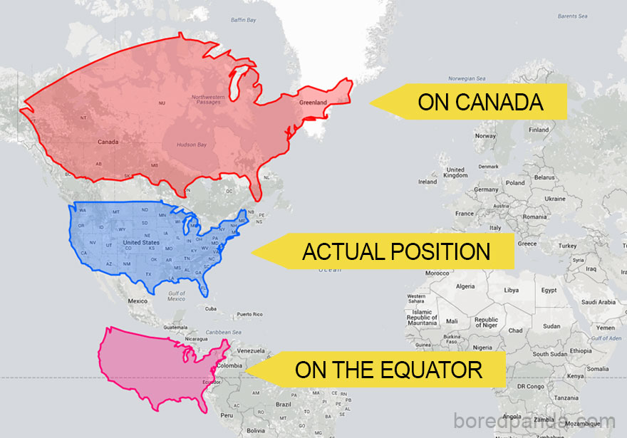
The US Could Easily Cover The Whole Of Canada But It Becomes Much Smaller When It’s Moved South
#20
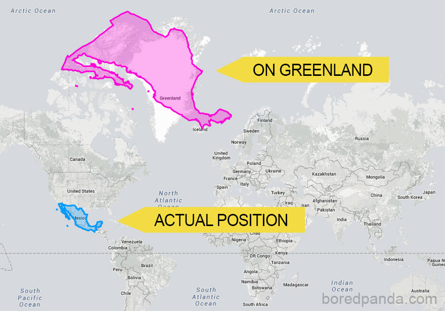
When You Move Mexico Onto Greenland Its Size Increases Dramatically
#21
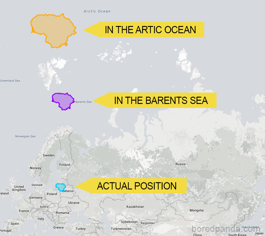
If Lithuania Was An Island In The Barents Sea And Artic Ocean
#22
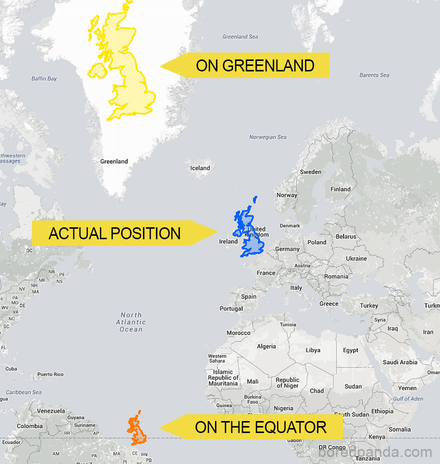
Moving UK North And South Reveals How It Actually Compares To Other Countries
#23
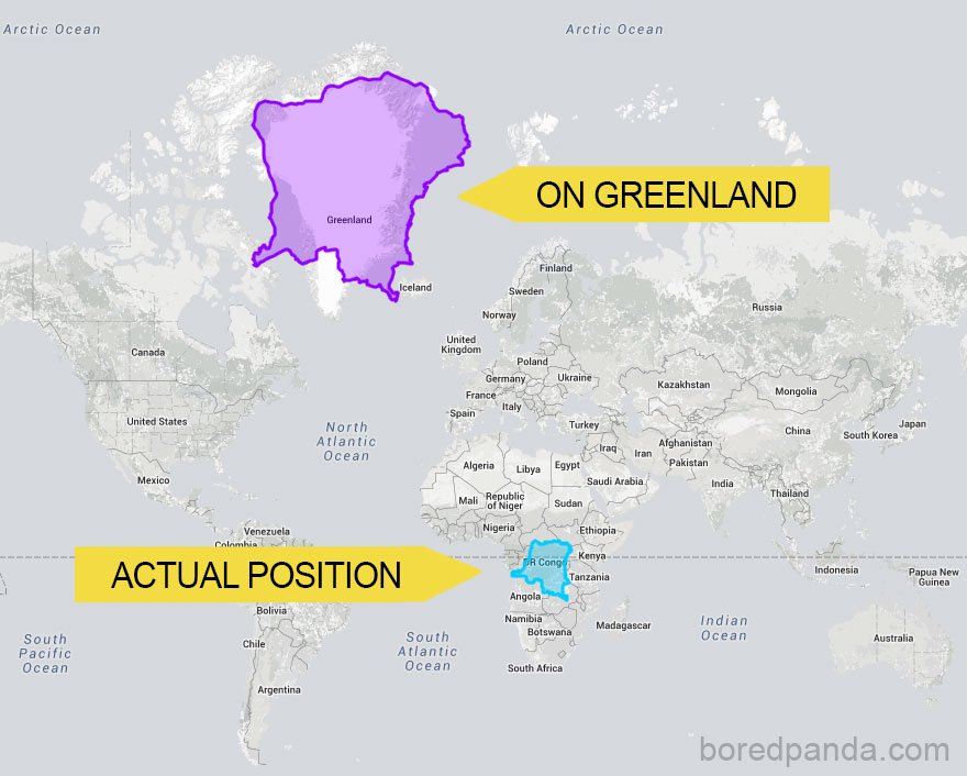
Democratic Republic Of The Congo When You Move It North
#24
How The Size Of Russia Changes As You Move It South
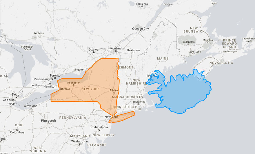
#25 #27 Tiny Iceland Compared To New York
#26
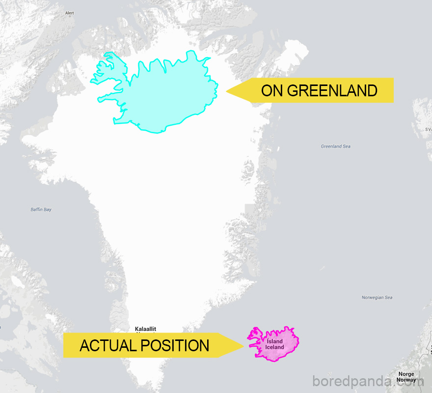
Tiny Iceland Compared To Its Giant Neighbor Greenland
#27
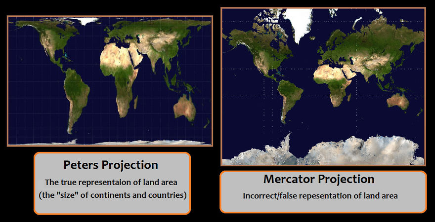
Let Me Just Make This Easy; The Issue Is Peters (accurate) Vs Mercator (inaccurate).
#28
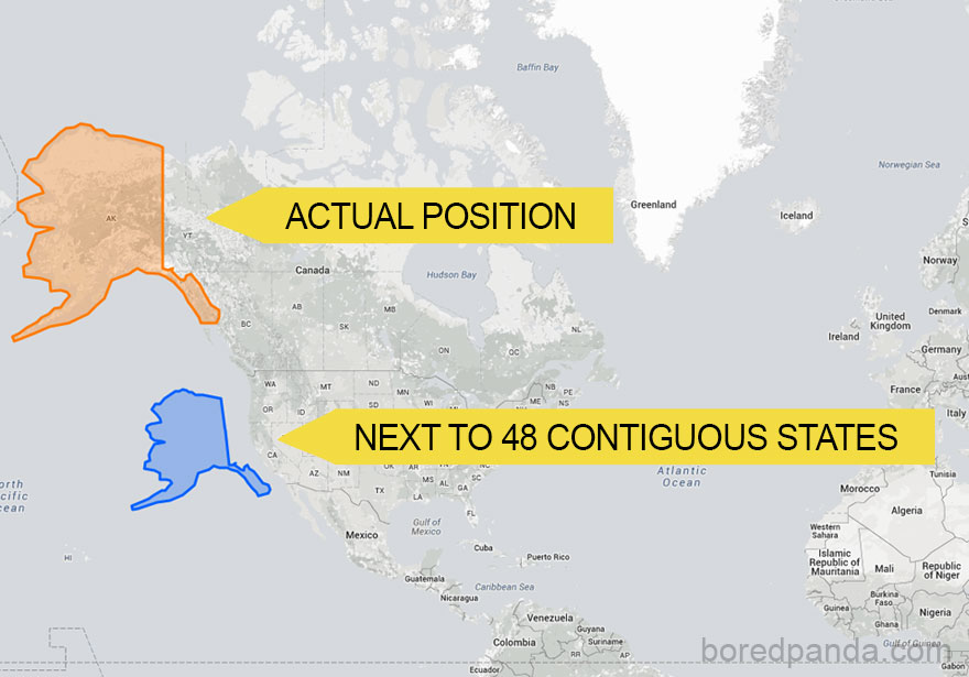
Alaska Doesn’t Seem So Big When Compared To 48 Contiguous States
#29
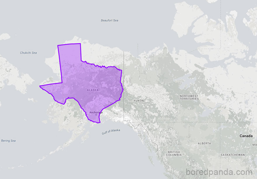
Texas Moved On Top Of Alaska Shows That They’re Almost The Same Size
#30
You Cannot Make Legitimate Size Comparison Unless You Are Doing So On An Equal Area Map


